

A potential client hears about your firm from a colleague. They could find you by seeing one of your LinkedIn posts or an article you wrote. Alternatively, your name may come up when they’re researching other potential partners.
However they find you, your website will play a major role in how they perceive your firm. That’s why strong professional services website design matters.
In most cases, interested prospects will visit your website before calling, booking a meeting, or even responding to an email. A referral can put your firm on their radar, but your website often confirms whether your firm has the right experience.
Once they land on your website, they want to understand exactly what you offer, who you have experience working with, and whether you look like a company they can trust.
That gives your website an important job. It can’t just look professional. It needs to explain complex services, demonstrate expertise, and make it easy for prospective clients to take the next step.
Effective professional services website design brings all of those pieces together. It combines strategy, messaging, branding, content, user experience, development, and lead generation into one connected experience.
So, now we know that the best professional services websites are essential. But what does great website design for the professional services industry actually look like in practice?
Why Professional Services Website Design Is Different
Before we continue, we need to all agree: Buying a professional service isn’t like buying a pair of shoes or choosing a restaurant.
The service may involve a significant investment. The work may continue for months or years. It may also affect the client’s finances, employees, reputation, technology, or future growth.
For example:
- An accounting firm may need to explain several overlapping tax and advisory services.
- An engineering consultancy may need to demonstrate highly technical experience to both procurement teams and project leaders.
- A law firm may need to build confidence without overwhelming visitors with legal language.
Prospective clients need more than a short product description and a checkout button. They need to understand your expertise, your process, and your ability to solve their specific problem.
And (as you probably know), the decision-making process also takes longer. A visitor may first discover your firm months before they feel ready to speak with someone. They might read several articles, review your services, visit team profiles, and compare you with other providers.
Your professional services website needs to support all of those stages.
It should help early-stage visitors learn. It should help active buyers evaluate your firm. It should also give ready-to-act prospects a clear path to contact you.
At the same time, the site may need to serve several audiences. A consulting company could work with executives, operations teams, marketing leaders, and procurement departments. An accounting firm may serve businesses, individuals, and nonprofit organizations.
The best website design for professional services makes those paths clear without turning the navigation into a maze.
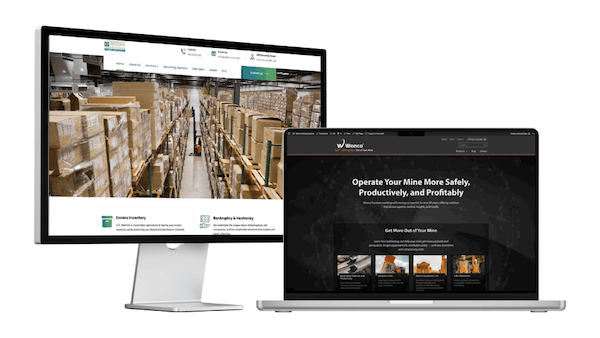
See our work with A.D. Hennick and Wenco
Professional Services Website Strategy and Content Best Practices
Start With the People You Need to Reach
One of the most common website mistakes happens before anyone even selects a colour, font, or page layout.
The project starts with a list of organizations instead of the actual audience.
The mistake here is that teams focus on how the company describes its departments. They build navigation around an organizational chart. They fill the homepage with company history, internal terminology, and broad claims about excellence.
But a website visitor is usually trying to answer a much simpler question: “Can this company help me?”
This is where you start.
Think about the people you want to reach the most, and what they need to find. A potential client may want to understand your services or review past work.
Someone who came through a referral might already be interested. But they still want reassurance that your firm has the right experience and feels like a good fit.
Explain What You Do Clearly
Professional services can be difficult to explain.
The work feels obvious to the people delivering it every day. To someone outside the firm, it may sound technical, complicated, or very similar to what every competitor offers.
This disconnect can lead to vague language on your website.
You have probably seen phrases such as “innovative solutions,” “results-driven service,” or “a commitment to excellence.” They sound polished, but they don’t really tell a potential client much.
Your website should quickly answer a few basic questions:
- Who do you help?
- What problem do you solve?
- What service do you provide?
- What result can the client expect?
Organize Services Around Client Needs
A strong services website should make it easy for any visitor to quickly understand which service fits their situation.
That may sound obvious to you. Unfortunately, many professional services websites still make people dig through unclear navigation, overlapping service categories, and long pages filled with internal terminology.
The best thing you can do is to keep your primary navigation simple. Use labels that visitors will understand without any confusion. “Services,” “Industries,” “Our Work,” and “Insights” probably don’t feel very creative, but people know what those terms mean.
Each core service should usually have its own page. That gives you room to explain the problem, your approach, and the expected outcome. It also helps search engines understand what each page covers.
Individual service pages shouldn’t read like a grocery list. Instead, make sure you connect each feature to its value. For example, don’t stop at saying that your consulting package includes stakeholder interviews. Explain that those interviews help uncover conflicting priorities early, before they delay the project.
Show Proof Instead of Relying on Claims
Most professional services firms say they’re experienced, trusted, and committed to delivering results.
Your prospects have heard all of that before. What they really want is evidence.
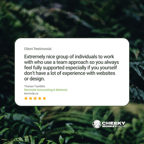
Client logos, certifications, and awards can create an initial sense of credibility. Case studies and testimonials go further because they show what your firm has actually done.
By the way, a useful case study doesn’t need to be dramatic. A basic but effective case study just needs to explain the client’s challenge, what your team did, and what improved.
That improvement could be more qualified leads. It could also mean fewer support requests, faster internal processes, easier content management, stronger search visibility, or a smoother experience for users.
Make Your People Part of the Website
Professional services depend on people. Clients want to know who will advise them, lead the work, or join their meetings. However, many firms hide their experts behind a generic company voice or a basic team directory.
Team pages should do more than show headshots and job titles.
A useful profile can explain a person’s areas of expertise, industry experience, approach, and relevant qualifications. It can also connect visitors to articles, webinars, case studies, or services associated with that individual.
This helps the visitor understand the depth of your team. It also gives your experts a visible role in your professional services branding.
Create a Services Website That’s Easy to Use
Balance Strong Design With Clear Communication
If we haven’t said it clearly enough yet, a polished website matters.
Outdated layouts, inconsistent branding, poor spacing, and weak imagery can make a highly capable professional services company look less established than it really is.
But good design can’t rescue confusing messaging.
Some websites rely on large videos, rotating banners, and dramatic animation while hiding the information visitors came to find. Others simplify so aggressively that there is barely enough context to understand the service.
The best design helps people focus. It creates a clear hierarchy, breaks complicated information into manageable sections, and draws attention to what matters most.
Prioritize Accessibility, Performance, and Mobile Usability
Even if your website looks great on your designer’s desktop, it can still be frustrating to real users.
This could happen if it:
- Loads too slowly
- Has text that is difficult to read
- Is hard to navigate on a mobile device
- Has forms that are impossible to complete with only a keyboard
These are not small technical issues. They shape how people experience your firm.
Build accessibility into the website from the beginning. Use readable text, strong colour contrast, clear headings, descriptive links, properly labelled forms, and meaningful alternative text for images.
Pay attention to speed as well. Oversized images, unnecessary scripts, autoplaying videos, and too many plugins can make even a beautiful website feel slow and clunky.
Test the site on real phones and tablets. Don’t just shrink the desktop layout and assume the job’s done.
Tips for Turning Website Visitors Into Qualified Leads
Use Content to Build Trust Before the Sales Conversation
Not everyone who visits your website will be ready to contact you. That doesn’t mean the visit was wasted.
A useful article, guide, webinar, or case study can help someone better understand their problem. It can also keep your firm in mind until they are ready to take the next step.
But how do you make sure your content is actually helpful? The strongest content usually comes from real conversations.
What questions do clients keep asking? What mistakes do you see repeatedly? What decisions tend to cause confusion? Those topics are often far more useful than publishing something simply because a keyword has search volume.
Give Visitors a Clear Next Step
Another important part of content: Make sure that it leads somewhere.
Some professional services websites provide a lot of useful information and then stop.
There’s no clear button or link that asks them to make contact. Or there are so many different buttons that visitors are not sure which one matters.
Keep in mind “Learn More,” “Explore,” “Discover,” and “Get Started” may sound friendly, but they can also feel vague.
Depending on your firm and the placement on your website, try more descriptive calls to action:
- Book a Consultation
- Discuss Your Project
- Request an Assessment
- Talk to a Specialist
- View Our Work
- Download the Guide
Each page should have one clear primary action. You can include secondary options, but they shouldn’t compete equally for attention.

Design for a Self-Directed Buyer Journey
Visitors don’t move through your website in the order you expect.
Someone may find a blog post through Google, click through to a team profile, read a case study, and then visit a service page. A referral may skip your homepage entirely and go straight to your contact page.
That means every important page needs to work as a starting point.
Use internal links to connect related information. A service page can lead to a relevant case study. A blog post can point toward a service, guide, or consultation.
This helps the site feel connected instead of like a collection of unrelated pages. It also supports people at different stages of the buying journey.
Connect the Website to Marketing and Sales
Your website shouldn’t work separately from the rest of your marketing.
Social posts, email campaigns, search ads, and blog content bring people to your site. But once they arrive, the website needs to help them take the next step.
The website should also make it easier for your team to follow up. Forms can send inquiries to the right person. Downloaded resources can trigger a relevant email. Analytics can show which campaigns and pages are bringing in qualified leads.
When your website and marketing work together, it becomes easier to understand what’s working and where your team needs to focus on improving.
How to Choose Professional Website Design Services
Choosing a web development agency based only on visual style can lead to problems.
A professional services website needs more than attractive page layouts. It needs strategy, content, design, development, SEO, analytics, and an understanding of how complex buyers make decisions.
Review the agency’s previous work, but look beyond the screenshots.
Ask how they approached the problem. Did they improve the navigation? Make the firm’s positioning clearer? Support multiple audiences? Connect the website to marketing systems? Make ongoing updates easier?
The right professional website design services should give you a process, not just a product.
Cultural fit matters too. A website project can take several months and involve difficult decisions. You need a partner that communicates clearly, respects your team’s expertise, and feels comfortable providing honest recommendations.
What Strong Professional Services Websites Get Right
The best professional services websites don’t all look the same.
A global consulting firm, a regional accounting practice, and an independent financial advisor will have different audiences, services, and brand personalities.
The strongest sites still share a lot of similar qualities:
- They explain who they help
- They make complex services easier to understand
- They show real evidence of expertise
- They help visitors find relevant information without digging
- They balance educational content with commercial pathways
- They make the next step obvious
Most importantly, they treat the website as a strategic business tool.
The design supports the firm’s positioning. The content helps prospective clients make decisions. The technology connects with marketing and sales. The team measures what works and continues improving it.
This approach creates more than a modern homepage. It creates a website that supports the full client journey.
Build a Website That Supports Your Firm’s Growth
Your website may not close the deal on its own, but it can decide whether someone reaches out to you.
Prospective clients use it to check out a referral, compare firms, understand your approach, and decide whether you feel like the right fit. If the site feels unclear, outdated, or difficult to use, they’ll probably pass you over.
A strong website helps prevent that. If done right, your services are easier to understand, and people are more likely to trust your expertise. It also creates a clear path from their initial research to a real conversation.
Not sure whether your website is doing enough of that right now?
Cheeky Monkey Media helps professional services firms improve the strategy, messaging, and design behind their websites. Whether you need a full redesign or a focused plan to improve what you already have, we can help you figure out the right next step. Connect with us for a quick 15-minute chat about what needs to improve.
Frequently Asked Questions
What should a professional services website include?
At a minimum, your website should make it easy for people to understand what you do, who you help, and how to get in touch.
That usually means clear service pages, team profiles, examples of your work, testimonials, useful resources, and information about the industries or clients you support.
The exact structure will depend on your firm. An accounting firm will need something different from an engineering consultancy or financial advisory practice. What matters is that visitors can quickly find the information they need without having to dig for it.
How can an effective professional services website generate more leads?
A good website helps visitors move from “I’m interested” to “I’m ready to talk.”
That starts with clear messaging and useful information. From there, give people an obvious next step, such as booking a consultation or downloading a guide.
You also need to make the process easy. Keep forms simple and use specific calls to action. Most importantly, show enough proof to help visitors feel confident reaching out to you.
Does every service need its own page?
Most of the time, yes.
A separate page gives you room to explain who the service is for, what problem it solves, how your process works, and what someone can expect from working with you.
It also makes it easier for visitors to find the right information more quickly. Plus, these pages can help your website appear in searches for specific services.
That said, you don’t need a separate page for every small task your team can perform. Focus on the main services people actively look for and buy.
Do professional services firms really need case studies?
You’d be surprised by what a big difference these can make.
Most firms say they are experienced, reliable, and results-driven. A case study shows what that actually means.
It doesn’t need to reveal confidential information or include a huge revenue win. In the most basic terms, explain the client’s challenge, what your team did, and what improved because of your work. That might include fewer support requests, a smoother process, better accessibility, more qualified leads, or time saved internally.
How do I know if my website needs a redesign?
You may need a redesign if the website no longer reflects your firm, makes your services difficult to understand, or feels outdated.
A lack of leads can also be a sign, especially if people visit the site but don’t contact you much.
That’s not us saying that you’ll always need to rebuild everything. Sometimes small updates and maintenance tasks like better messaging, simpler navigation, or stronger service pages can solve the biggest problems.