
Companies that come to us often have B2B website design that looks fine at first glance—but fine isn’t the same as effective.
A professional website needs to do more than look polished. It needs to answer the questions your audience is already asking: What do you do? Is it relevant to us? Can we trust you? What should we do next?
Plus, when it comes to B2B, it gets even more complicated because several decision-makers are involved, each looking for different information. When the messaging is vague, or it’s hard to find the right information, a nice-looking design can only do so much.
Good visuals won’t fix the bigger problem.
What matters is whether the site makes things clearer for buyers or adds more work to an already complicated decision. That’s why our guide goes into detail about how your website should work to be effective. We’ll also get into the practical questions that tend to come up once a redesign is on the table.
What Makes B2B Website Design Different?
Website design for B2B companies isn’t just a more complicated version of a consumer website. The difference comes down to how people buy.
The B2B buyers visiting your site often do more research, consult with more colleagues, and make decisions that carry more risk. Because of this, they won’t usually land on your website the first time and make a quick decision.
Your website has to support that entire process — without becoming a maze.
You’re Speaking to Multiple Decision-Makers
A B2B purchasing decision usually involves several people, each with different questions.
One visitor may want to know whether your solution solves the right problem. Another may be focused on your website’s security, possible integrations or a long list of technical requirements. Someone else may be looking for pricing, proof or enough information to explain the decision internally.
That doesn’t mean cramming every possible detail onto every website page. Instead, create clear paths so people can get to the information that’s the most relevant to them.
Your Sales Cycle Is Longer
As we already said, most B2B visitors won’t be ready to buy the first time they hear about your company or visit your website.
Most of the time, they’ll revisit many times, compare the different leading providers, share pages with colleagues, or download resources. In some cases, they’ll read half your website before speaking to anyone.
That’s normal.
Your website shouldn’t treat every visit like the last chance to make a sale. It should help people do their research and feel more confident each time they come back.
Sometimes the right next step is booking a call. Sometimes it’s reading another article or reviewing your process.
Give people somewhere useful to go either way.
Your Offer Could Be Complicated
Most B2B products and services are more complicated and difficult to explain quickly.
You may have several service areas, custom solutions, technical processes, or terminology that makes perfect sense to your team but means very little to someone visiting for the first time.
Good B2B web design turns that complexity into a clear, easy-to-follow experience.
Use plain language first. Break dense content into manageable sections. Show people how the pieces connect, and explain why the details matter to them.
You don’t need to get rid of the complexity altogether. You just need to stop making visitors decode it on their own.
Your Audience Can Be Highly Specific
B2B companies aren’t trying to sell to everyone — so your website shouldn’t be for everyone either.
You may work with a certain industry, type of organization, job role, or business challenge. That gives you a chance to make your website much more relevant.
Remember, generic copy isn’t the way to go. If your content could belong to any company in any industry, your ideal buyer won’t see much proof that you understand their situation.
Speak to the work they’re trying to do. Address the questions they actually have. Show them that you know the pressures and priorities that come with their role.
Your Website is Usually Starting a Sale (Not Closing One)
For many B2B organizations, the website’s job isn’t to complete the entire transaction.
Its job is to help the right person take another step.
That could mean reading a case study, reviewing technical information, signing up for updates, sharing a page with a colleague, or requesting a conversation.
The goal is progress, not pressure. Your website should make it easy for buyers to keep moving, even when they aren’t ready to talk to sales yet.
10 B2B Website Design Best Practices
The best B2B websites make it easier for people to understand what they’re buying and why they should consider you. Here are some of the principles that make the biggest difference.
1. Explain Your Value Before Telling Your Company Story
Your homepage needs to help visitors instantly understand what you offer and why it matters.
Sounds obvious, right? But plenty of B2B websites open with headlines like, “Innovative solutions for a changing world.”
It sounds polished. It also says almost nothing.
Your visitors shouldn’t have to scroll through half the homepage before understanding what your company does.
Start with the outcome you help create. Make it clear who you work with and what problem you help solve.
You can talk about your history, process, and values later. First, give people a reason to care.
And remember, your homepage doesn’t need to explain everything right away. It just needs to make the right visitor think, “Okay, this sounds relevant.”
2. Organize Your Navigation Around How Your Buyers Think
Your visitors don’t know your internal structure. They may not know which department owns a service. Or use the same product names your team uses.
And they definitely don’t want to click through six nearly identical pages to figure things out.
Build your navigation around the way your buyers look for information. That might mean organizing it by:
- Service
- Solution
- Industry
- Audience
- Challenge
- Use case
- Product type
Choose the approach that best matches how people understand your offer.
And keep the labels clear. Clever navigation may feel creative, but it can quickly become annoying when visitors have to guess what each menu item means.
3. Give Different Decision-Makers a Clear Path
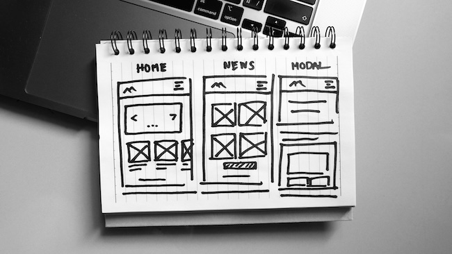
You don’t need to build a separate website for every person that’s part of the buying process. You do need to make it easy for them to find the information they care about.
An executive may want a quick overview of the business value. A technical evaluator may want documentation or integration details. A department lead may care more about implementation and day-to-day use.
They’re looking at the same offer from different angles.
Think about where those needs overlap and where they don’t. Then create visible pathways through your navigation, page content, related resources, and calls to action.
You’re not trying to show everyone everything at once. You’re helping each person find their next useful piece of information.
4. Make Complex Products and Services Easier to Understand
We know that B2B services are usually complicated. With the right website, complicated doesn’t need to mean confusing.
When someone reaches a service or product page, you need to make sure they’re able to understand:
- What you offer
- Who it’s for
- What problem it helps solve
- What working with you looks like
- Why the outcome matters
- What they can do next
You don’t need to explain every technical detail right away.
Start with the big picture. Use plain English. Then let visitors dig deeper as they move through the page.
Diagrams, examples, comparisons, FAQs, and short videos can help — but only when they make the content clearer. And watch out for pages that spend a lot of time describing your process without explaining why the reader should care.
5. Show Your Expertise Instead of Announcing It
Nearly every B2B company says it’s experienced, trusted, and innovative. Your buyers have definitely seen some combination of these words before.
Instead of telling people you know what you’re doing, show them. Build your brand’s credibility with content like:
- Relevant case studies
- Specific client outcomes
- Testimonials with actual substance
- Industry experience
- Team expertise
- Certifications
- Project examples
- Helpful articles and resources
- A clear explanation of your process
The best proof connects directly to the decision someone is making.
If you’re talking about a service, include a related case study. If you’re speaking to a specific industry, show relevant experience there.
6. Create Useful Content for the Whole Sales Cycle
Not everyone who visits your website is ready to book a call. Some people are still trying to understand the problem. Others may be comparing approaches or putting together a business case.
Your content should help them no matter where they are in the buying process.
A simple guide or checklist can help someone in the early stages. A case study, pricing context, or even an explanation of your process would be more helpful to a buyer who’s further along.
This is where your blog and resource library become much more than an SEO checklist item you need to complete.
Good content answers real questions. It shows people how your team thinks. It gives visitors a reason to come back, and it gives your sales team something useful to share.
The important word here is useful.
Publishing another generic article because the content calendar says Tuesday won’t do much for anyone.
7. Stop Using the Same Call to Action Everywhere
A visitor reading their first blog post won’t usually schedule a consultation. But that doesn’t mean you shouldn’t give them options to keep exploring.
The next step you give people should match where they are in the journey. That might be:
- Read a related guide
- Explore a case study
- Compare service options
- Download a checklist
- Subscribe for updates
- Request an assessment
- Talk with your team
Your high-intent pages can still use direct calls to action. Just don’t make Contact Us the only option across the whole website.
8. Build Trust Into the Whole Experience
Making sure you come across as trustworthy isn’t about dropping a row of client logos near the bottom of your homepage and calling it done. You need to work in trust signals across your entire website.
Clear messaging builds trust. So does useful content, consistent design, accessible pages, specific proof, and forms that explain what happens after someone submits them.
You also need to consider the small issues — some of them can weaken confidence in your expertise. We’re talking about things like an outdated article, a broken link, or a confusing mobile menu.
None of those things may seem huge on their own, but together they shape how people feel about your organization. This matters even more in B2B, public sector, professional services, and other high-trust spaces.
Your website should leave people thinking, “They understand the work, and they seem like they’d be good to work with.”
9. Don’t Let Visual Flair Get in the Way
Animations, video, and other interesting interactive elements can make your website more engaging. That being said, they can also slow the site down or make it harder for people to use.
A strong B2B website needs to work well on mobile. People should be able to read it easily, navigate with a keyboard only, complete forms, and understand the content without fighting with the design.
You can’t think about accessibility and overall performance as nice-to-haves or bonus features that you squeeze in at the end. They’re part of the experience that shows people who you are as an organization.
10. Plan for What Happens After Launch
Launching your B2B website redesign and leaving it there after is a mistake. In fact, it’s one of the best ways to make sure your expensive investment loses value more quickly.
Most B2B sites connect with a CRM, email platform, analytics, marketing automation, event tools, customer portal, or internal systems.
You need to think about these things in the planning stages. You don’t want to discover halfway through development that a critical integration needs much more work than expected—especially when everyone is already tired.
And after launch day, you need to ask important questions like:
- Who will update the content?
- How will you measure what’s working?
- What happens when your services change?
- How will you create new campaign pages without rebuilding everything?
Your website should keep improving as your organization changes, and you learn more about what your users need.
Looking at B2B Website Examples? Look Beyond the Pretty Parts
Reviewing B2B website design examples can help when you’re planning a new site or redesign. But only if you do it right. What we mean is don’t stop at the visuals.
As we’ve talked about, the best B2B websites don’t work simply because they use bold type, smooth animation, or an interesting colour palette. They work because the design supports a clear strategy.
When you’re gathering B2B website inspiration, look at how the site handles the actual buyer experience.
Can you quickly understand what the company offers? Does the navigation make sense? Can different audiences find relevant information? Where does the site show proof? Does the next step feel clear?
Take a look at the mobile version too. Plenty of sites look impressive on a large monitor and become a different creature completely when you look at it on a phone or tablet.
Most importantly, ask why each design choice is there.
A feature that makes sense for a software company with a free trial may not help a consulting firm with a six-month sales cycle.
Take inspiration from the strategy — not just the shiny bits.
3 of Our Favourite B2B Website Design Examples
1. Webflow
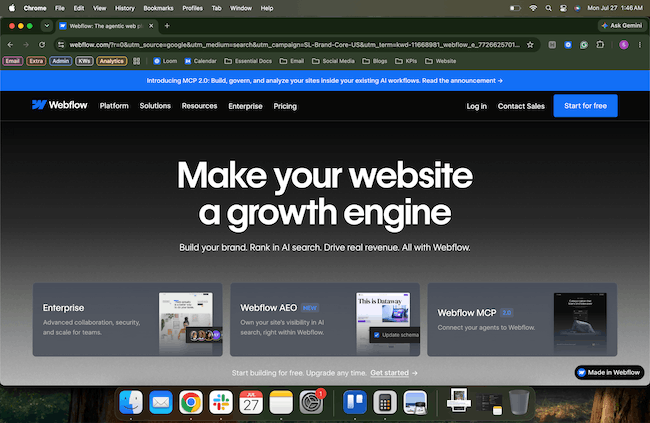
Webflow has a lot of people to speak to. Marketers, designers, developers, agencies, and enterprise teams may all land on the same site, but they’re not looking for the same thing.
Instead of forcing everyone through one generic story, Webflow gives people clear ways to explore the platform based on what matters to them.
That’s what makes the site work.
The takeaway for your own site is simple: you don’t need to show everyone everything at once. Help people recognize where they fit, then give them a clear place to go next.
2. Slack
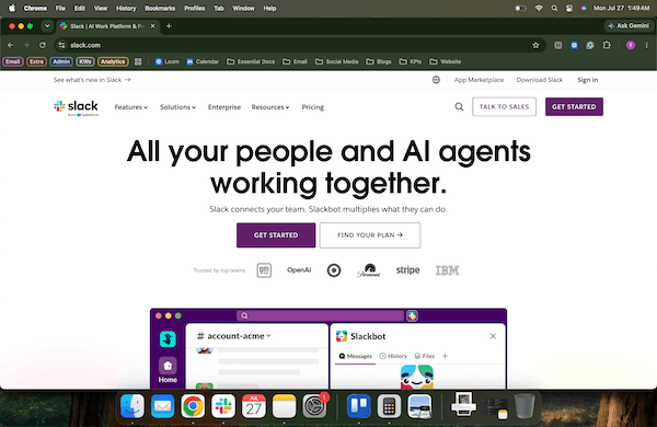
Slack does a good job of giving buyers room to explore.
Some people are ready to get started. Others want to compare plans or understand how the platform works. Larger organizations may need more detail before they’re ready to make a decision.
Slack supports all of those paths without making the experience feel cluttered.
You don’t need to push every visitor toward the same CTA. Give people a useful next step that fits where they are.
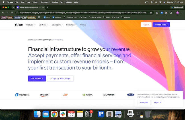
3. Stripe
Stripe has a lot to explain. It serves business leaders who care about outcomes and developers who need technical details. It covers payments, billing, embedded financial tools, and a long list of related products.
That could get overwhelming quickly.
Instead, Stripe starts with the bigger picture and lets visitors dig into the details that matter to them. Business buyers can understand the value without wading through technical language, while developers can jump straight into documentation and implementation details.
If your offer is complicated, your website doesn’t need to pretend otherwise. It just needs to explain things in a way that helps people understand what matters to them and where to go next.
When Does a B2B Website Redesign Make Sense?
A full B2B website redesign may make sense when your current site isn’t supporting where the organization is headed.
Maybe your services have changed, but the site still tells the old story. Or maybe the navigation has become increasingly messy. It could also be that your CMS makes routine updates much harder than they should be.
Other warning signs include:
- Visitors don’t understand what you offer
- Important content is buried or outdated
- The site doesn’t serve your key audiences
- Accessibility issues appear throughout the website
- Performance problems keep piling up
- Your integrations don’t work properly
- The design no longer reflects your organization
- Your marketing team keeps working around the website
But you don’t always need to rebuild everything.
A messaging update may solve the biggest issue. You might need to simplify the navigation, improve a few key pages, or work through accessibility problems in focused stages.
Start with the actual problem. Then decide whether you need a new foundation or a practical improvement plan.
“Redesign everything” isn’t a strategy. Sometimes it’s just a very large scope.
Make Your B2B Website Easier to Understand — and Easier to Improve
When potential leads land on your website, they need to be able to understand what you do and why it matters to them quickly.
From there, it should give them a clear way to keep going.
That’s the real goal of B2B website design. Not a prettier digital brochure. Not design for design’s sake.
You need a website that helps buyers through a complicated decision and gives your internal team a stronger foundation to work from.
Cheeky Monkey Media helps organizations plan, design, build, and improve B2B websites around real audiences and your specific business goals.
Maybe your current site needs a full redesign. Maybe it needs a focused plan and a few meaningful improvements.
Either way, we’ll help you sort out what matters most and make the change feel manageable.
Ready to make your B2B website work harder without making your internal team work harder? Let’s talk.
Frequently Asked Questions
How is B2B web design different from B2C web design?
B2C websites often help one person make a quicker purchasing decision. With B2B, you may need to support several stakeholders over a longer period. Buyers usually need more information, stronger proof, and different ways to take the next step.
How much does it cost to create a B2B website?
Here comes the answer everyone loves: it depends.
The cost of creating a B2B website changes based on what the project actually involves.
A smaller site with straightforward content and limited functionality will require a very different investment than a large, multilingual website with several audiences, custom integrations, and a complex content migration.
Because of this, you need to be careful when comparing agency proposals. Make sure they cover the same work. The lower estimate may look tempting, but not when missing work turns into a pile of surprise costs later.
What pages should a B2B website include?
Your site structure will depend on your company, but most B2B websites need a clear homepage, detailed service or product pages, proof of your experience, useful resources, and an easy way to contact your team.
You may also need pages for specific industries, audiences, integrations, technical documentation, or comparisons.
Don’t add pages just because another B2B website has them. Build the structure around what your buyers need to understand.
Do we need a full B2B website redesign?
Not always. A full redesign makes sense when the structure, technology, or overall experience keeps getting in the way. But if the biggest problems come down to messaging, content, navigation, or a few key user journeys, you may be able to make focused improvements instead.
A website assessment can help you figure out what actually needs to change before you commit to rebuilding the whole thing.