Today’s web design is pretty exciting, and at the same time pretty demanding on its architects. With the desire for device-agnostic interfaces and websites, designers, more than ever, need to focus on function over form.
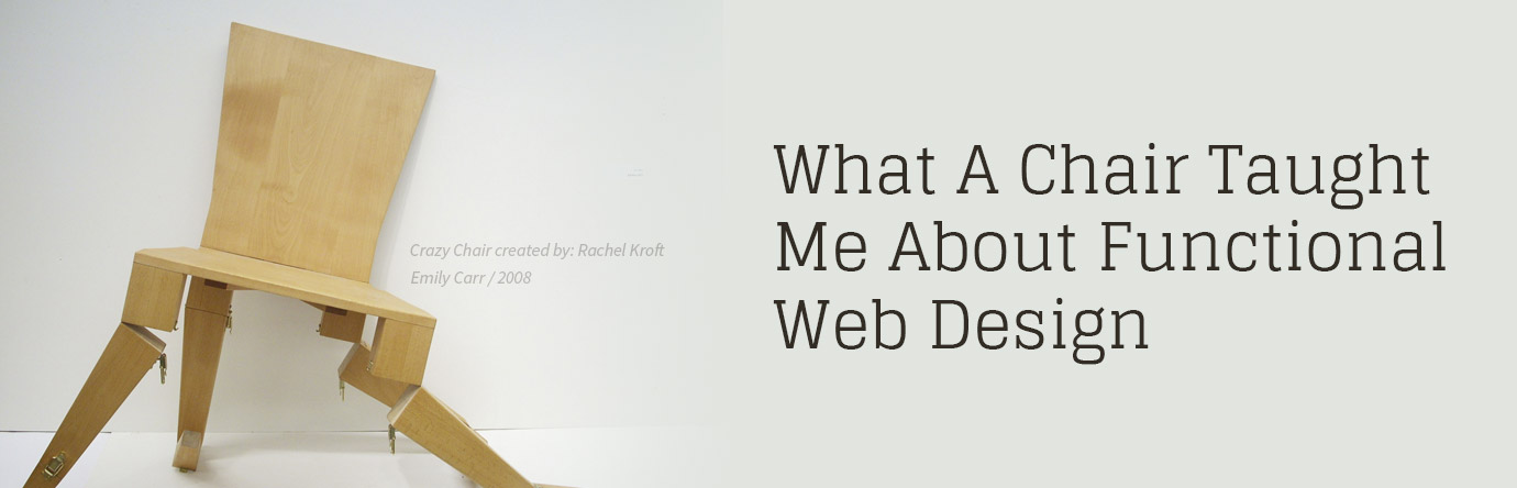
The Chair
I recall a project in college where we were tasked with designing a chair. We could build it out of any material, make it any shape, etc. One of the only requirements was that it had to be usable (if you couldn’t sit on it, it was a failure), and it had to be able to support the weight of a 300-pound person.
Challenge accepted. Of course, our team wasn’t just satisfied with the stated parameters – we wanted to solve other problems and include all sorts of extras. We wanted to remove back stress so we designed it like those knee-sitting chairs. We also decided it needed to have a moveable attachment for a drawing board (it had suddenly become a chair designed for artists) and essentially created a replacement for the ‘drawing donkey’. Which is a bench with a couple of grooves and support in the front for your drawing board.
We all hated drawing donkeys, but in hindsight, that simple design has withstood many years of use. So to make a long story short, the chair we built could support 300 pounds, but it weighed 70 pounds itself and with all its moving parts it was even harder to move and set up. Okay, lesson learned. Maybe.
The Lesson of the Chair
What we failed to see was the goal, and it was there all along… “make a chair that works, as a chair”.
Building a functional website isn’t as easy as it sounds, but it is of paramount importance. If your visitors can’t use it, it’s like that 300-lb person crushing your chair made of pipe cleaners and streamers (but hey, it looked nice). You may also want to check out an article our CEO wrote on functional web design last year.
What we failed to see was the goal, and it was there all along… “make a chair that works, as a chair”.
Loving to Over-Design
Designers have always loved to design (strange I know), but more and more are realizing that design does not mean ‘embellish’ at the cost of functionality. Of course, there are times when you want to wow people with aesthetics, but at its core, it has to work, and not impede the visitor or the site’s main goals. You could almost say that the design should be ‘felt’ not seen.
So where some designers created with flare and exuberance before, they should now be stimulated by the challenge of simplicity and the elegance of function. The form can be there, but not at the expense of function. That’s not to say that every site needs to look like a Bootstrap template or the flat design that pervades everything today. Always following trends impedes innovation, but there is an important message to be learned from this current trend – the user first, and just keep it simple.
Function facilitates the goals of the site, so make sure you know them
Going back to the chair design example, part of the problem could have been that the goals of the project were not clearly defined at the outset (other than a couple of requirements), and this too happens with web design.
It is important to know what it is – very clearly – the website needs to do. Too many companies want a website that acts like a multi-armed employee, and it ends up being this horrendous Jack-of-All trades but an Ace-of-none, that tends to satisfy the egos of the marketing department or designer rather than do its job properly.
The challenge? Create simple, functional, but beautiful websites… piece of cake right?