Do I Have a Content Organization Problem or an Information Architecture Problem?
You probably have both. In fact, they’re usually one and the same.
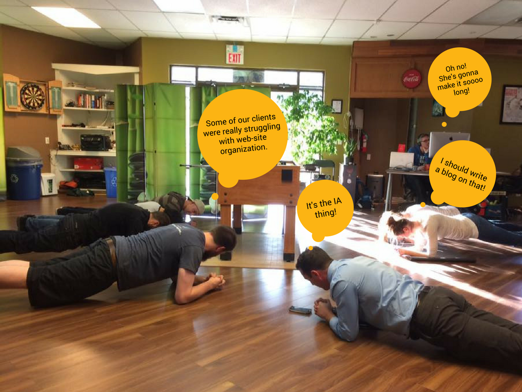
One afternoon, while we were busy working out, the troop got to talking about organizing and re-organizing website content. We observed that a number of our clients had come to us with what they called Frankenstein websites.
What’s a Frankenstein Website
“In design, we refer to a Frankenstein website as a site design that incorporates a number of different design concepts mashed together to make the whole” ~ Chris Arlidge, Design and Marketing Director, Cheeky Monkey Media
A Frankenstein website is a poorly organized and confusing website. It’s a website that just doesn’t make sense. People visiting your website can’t figure out how to navigate it. Administrators updating your website have a difficult time adding content because it’s difficult to figure out how things are organized. There is content chaos everywhere.
This unfortunate website situation usually occurs when the information architecture doesn’t follow the 8 principles of information architecture (more on this below). It can also happen when more than one design concept is shown and elements from each are incorporated into the final design, for example, when there are too many cooks in the kitchen.
When you find yourself desperately wishing for a beautifully intuitive and easy-to-use website, you are in the presence of a Frankenstein website.
This is the position many of our clients are in when they first come to our troop. They are looking for a way to better organize content on their websites to make the end user’s (their target audience’s) website experience feel intuitive and easy.
Sound familiar? Read on user-experience warrior, defender of user-friendly websites, slayer of ROI ruining website monstrosities, champion of websites that speak to the target audience, knight of…

Before you continue, I should warn you that this is a fairly comprehensive (and long) post. It covers:
1. What causes poor information architecture (disorganized and convoluted Frankenstein Websites)
2. Information Architecture Definition
3. How to Make Your Website’s Information Architecture Feel Intuitive
- Determine what you want to achieve with your website
- Get to know your target audience
- Invest in keyword research and SEO Best Practices
- Take the time to do a card sort
- Follow the 8 principles of information architecture
- Don’t forget your wireframes
- Build it, test, and adapt as necessary
Poor Information Architecture = The Frankenstein Website
Usually, organizations and businesses end up with this sort of unfortunate website situation because their initial website design didn’t follow Dan Brown’s Eight Principles of Information Architecture outlined by Cameron Chapman in her ultimate guide to information architecture. These are:
- Principle of objects
- Principle of choices
- Principle of Disclosure
- Principle of exemplars
- Principle of front doors
- Principle of multiple classifications
- Principle of focused navigation
- Principle of growth
In particular, websites plagued with Frankenstein-website-disease suffer because their website information architecture fails to adequately account for the principle of objects and the principle of growth.
Principle of objects
According to Chapman,
“the principle of objects means that content should be treated as an evolving thing that has its own lifecycle.”
This means that you need to look at website content (be it videos, images, calendars, items for sale, membership portals, blogs, etc) as living and breathing entities that will evolve over time. As they evolve, so will their needs. The design (or content layout) of your website needs to plan and account for that.
Principle of growth
This brings us to the 8th law of information architecture. As Chapman explains,
“on the vast majority of sites, content is a fluid, changing thing. The amount of content you have on a site today may be only a small factor of what you’ll have tomorrow, next week, or next year.”
If your sitemap doesn’t anticipate this growth and evolution, you are going to end up with a website that is difficult to navigate and understand.
That’s what had happened to many of our clients.
Over time, large amounts of content were added to websites that didn’t have the structures or processes in place to accommodate it. As a result, these websites turned into disorganized and unbearably frustrating monstrosities, otherwise known as Frankenstein websites.

Sound familiar? I thought so. It’s a pretty common website illness. Luckily, it’s curable. All you have to do is get up close and personal with your website’s information architecture.
Wait a minute! …
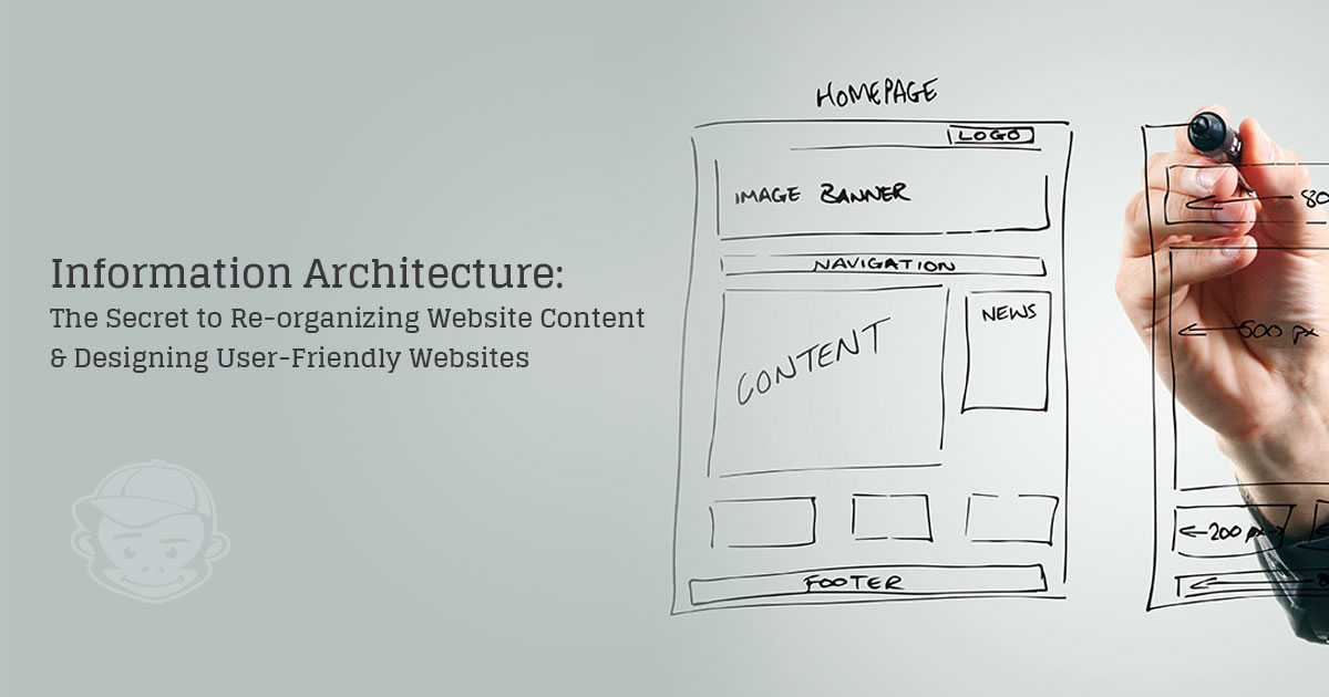
What Is Information Architecture Exactly?
I was hoping you’d ask.
According to the Information Architecture Institute,
“information architecture is the practice of deciding how to arrange parts of something to be understandable.”
Chapman defines it as:
“First and foremost, … the structure of shared information. It’s how the content on a website, intranet, online community, or other digital space is organized and labeled.”
UX Booth explains that:
“When a content strategist begins separating content and dividing it into categories, she is practicing information architecture. When a designer sketches a top level menu to help users understand where they are on a site, he is also practicing information architecture.”
Thus, information architecture combines the end user’s (your target audience’s) needs, how they work through problems and navigate spaces, and what your organization would like to achieve with your website. Information architecture takes into account how these factors will change and evolve over time in order to organize the flow and organization of your website in a way that feels intuitive to the end user.
Another way to look at information architecture is to look at how different elements of your website (multimedia and text content, internal and external technologies, and various users) interact with one another and then focus on creating systems, structures, and processes that make this interaction as seamless as possible for the end user. That last part is important: Information architecture isn’t focused on you, the organization. Information architecture is focused on the end user. The members of your target audience that are coming to your website.
Easy, right? Yeah, that’s what I thought.
How Do I Make My Website’s Information Architecture Feel Intuitive?
Actually, ensuring that your website offers an excellent user experience and feels intuitive to the end user only takes seven steps.
1. Determine what you want to achieve with your website
Before you do anything else, and I mean anything else, determine what you want your website to do. This is not something you can figure out on your own. You need to talk to your stakeholders and make sure that your website goals are aligned with your business goals. Not sure who your stakeholders are? Kris LaGreca from the New Possibilities Group shows you how to do identify your stakeholders and what role they will play in your website redesign.
In addition, you are going to need to know how to measure these goals. Step seven in the Frankenstein website involves testing assumptions and adjusting accordingly. However, in order to test how well something is working, you need to know how you are going to measure success.
Common macro website goals include:
- Getting qualified leads that you can sell your product or service. For most service-based industries, this will be your main (macro) goal.
- Student applications and inquiries: If you are in charge of a University’s main page, your main goal will most likely be student applications, and, most likely, donor inquiries.
- Sales: If you’re an ECommerce website like Amazon, Victoria Secret, or Nike, your main goal will be sales.
- Donors and Volunteers: Working in a nonprofit? Your ultimate goal for the website is probably going to be getting new donors and volunteers.
These goals are usually pretty easy to measure. All you have to do is count the number of lead forms, registrations, sales, or other applications submitted.
But what about if your website’s main purpose is to act as a resource?
Some organizations, including those that fit in the verticals mentioned above, will have different macro goals. For example, your main goal for your website might be to use your website as a resource or as an avenue of engagement. That’s fine. In fact, that’s a fantastic purpose.
However, the measurements for these less obvious macro goals can be a bit trickier. Thus, you may wish to look at:
- The ratio of returning visitors to new visitors: When your website is designed to be a resource, you will want to see a higher number of return visitors than new visitors. This means that people are finding your content useful and they want to come back.
- Time on site vs. Pages Viewed. This one is a little trickier. When your website is a resource, you would want to see them spend time on your site (at least a couple of minutes per page, depending on length) and you would want users to look at multiple pages. However, you don’t want someone looking at, say ten pages in a minute and then leaving. This would suggest that they couldn’t find what they were looking for and left.
- Blog / Newsletter Sign-ups: Do people like your stuff? Do they want to receive it regularly?
- Social Engagement: If your content is good, meaning that it speaks to and engages your audience, they are going to share this content.
This is by no means an exhaustive list of metrics. Nor should you look at just macro metrics. But, it’s a good place to get started and start thinking about how you will know if the website is doing its job.
And, most importantly, you need to be able to communicate how both the micro and macro metrics that you’re measuring contribute to the metrics that are most near and dear to your stakeholders’ hearts. How do you do that? I mean, let’s be honest, if you’re in the C-level, you’ve probably gotten frustrated with your marketing team babbling about traffic going up and time on site expanding when all you care about is leads. Similarly, if you’re part of the marketing team, you’ve probably gotten frustrated when the C-suite didn’t seem to care about those massive improvements you’ve made in social traffic acquisition. There’s a trick for that. You need to figure out “How to Tie Marketing Metrics to the Data that Boards, CxOs, and Investors Really Care About.”
Need help figuring this out? Give us a call. Our marketing team can help!
2. Get to know your target audience
Knowing what you want to accomplish with your website is great, essential actually. But, knowing what you want your website to do is useless, if you don’t understand your target audience.

At Cheeky, we like to do user persona research. Since I’ve already gushed about this process excessively in the Introduction to Buyer Personas and a copy of some of our user persona in Rick’s most recent blog, I won’t get into that here.
That said, I cannot stress the importance of user research enough. Remember, “the goal [of information architecture and your site] is to help users find information and complete tasks” (usability.gov). If you don’t understand your user’s motivations, struggles, research habits, and instigating incidents, how can you expect to be effective in designing a website that gives them the information they need when they need it?
Don’t have time to do this research? Have us do it for you
3. Invest in keyword research and SEO Best practices
Keyword and Concept Research
In Rand Fishkin’s Whiteboard Friday, “Create a Content to Keyword Map,” Fishkin explains how you can use keyword research to :
- Identify keywords your website users are searching for that you don’t have content for. This is a missed opportunity that you may wish to consider creating content for.
- Identify areas of your site that is getting a lot of traffic, but that you haven’t assigned a specific intent to. For example, is there a page on your website that users always come to when they search “great gifts for the giver in your family” or “study tips for undergraduates” but you don’t have a specific job for that page? Keyword research can help you find those pages so you can ensure every piece of content on your site has a job that helps fulfill your macro goal.
- “Prioritize and focus your work.”Does most of your traffic search for one particular term, does this coincide with your user research? This is a good sign that you should make revising that portion of your work a priority.
In a previous Whiteboard Friday post, Fishkin explains how you can use “Related Topics and Semantically Connected Keywords” to make sure that your content answers the right questions related to each keyword. For example, when people search for one word, what other words are usually associated with this main keyword? Why is that important? (1.) It can give you hints about what your users are looking for. (2.) It can help your content show up in the search results.
SEO Best Practices
Having a well-thought-out information architecture isn’t only important because of your users. Google and other search engines use your site architecture when they store information about your site that they show to searchers. Search Engine Journal’s “Site Architecture & Search Engine Success Factors” gives a fantastic explanation of how this works.
In the most simple terms, however, you want to consider:
- How easy it is for the search engine to quickly go through your website and make an ‘imprint’ on every page.
- Not having the same content appear in two different places. For example, do you have a page that has two URLs? This occurs when you have the same say recipes section in two places: https://sitename.ca/section1/recipies and https://sitename.ca/section2/recipies. The page looks exactly the same, but it lives in two different places on your website. The poor page! It must be so confusing.
- Is your website mobile friendly? As of November, Google now looks at mobile sites first.
- How fast is your site?
- Is it secure?
Overwhelmed yet? That’s not my intention, but SEO is a huge beast in and of itself. It’s not something you should attempt to tackle on your own. Even marketing agencies like ours have SEO specialists that focus on this specifically.
Hire an SEO Specialist to help!
We now interrupt this program with a short pee break:

4. Take the time to do a card sort
According to usability.gov,
“Card sorting is a method used to help design or evaluate the information architecture of a site. In a card sorting session, participants organize topics into categories that make sense to them and they may also help you label these groups. To conduct a card sort, you can use actual cards, pieces of paper, or one of several online card-sorting software tools.”
The idea behind a card sort is to get a better idea of how your target audience organizes and categorizes different ideas, concepts, and categories. This categorization and organization structure will then inform how you categorize and organize content on your website.

Depending on whether or not you have “a predefined set of categories” or are trying to determine how to label the different categories, “you may choose to do an opened or closed card sort:”
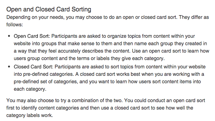
Regardless of which option you choose, it is best if you do the card sort after you complete your user and keyword research.
Why?
User and keyword research give you a sense of what language is used and in what combinations. The card sort gives you a chance to test any assumptions you may have made as a result of this research before you go too far in the website (re)design process. Moreover, card sorts enable the website design and development to get a clearer idea of user behavior and thinking patterns than they would have with just interviews and keyword research.
5. Follow the 8 Principles of Information Architecture (especially the principles of choices and disclosure)
If you forget everything else in this blog, please, please, please, remember these two key principles from Dan Brown. I beg you! What are they? Let me tell you:
“The principle of choices – Create pages that offer meaningful choices to users, keeping the range of choices focused on a particular task.”
and
“The principle of disclosure – Show only enough information to help people understand what kinds of information they’ll find as they dig deeper.”
Basically, what these two principles are getting at is to make sure that every piece of content on every single page has a specific role, and that this role guides the user to complete a specific action.
An Example for a Post Secondary Institution
Consider this: if you’re a post-secondary institution and your main goal is student registrations, and we are on the final page before the application, the page where the prospective student clicks the big “Submit an Application” button. What sort of options would we want to have on that page?
The main purpose of this page is to have the prospective student click “Submit an Application.” Thus, the most prominent choice on this page needs to be this CTA.
But, what about the other information that’s associated with this action? Extracurricular activities, scholarship opportunities, academic requirements, different programs, residences, and probably another twenty to thirty other factors.
Would you want to have all of these options prominent on your “Submit an Application” page?
Probably not, since each of the above-mentioned choices includes a plethora of other information that isn’t immediately relevant to the main objective at hand, having the user submit an application.
I’m not saying you can’t include links to this information, but before you do so, you need to consider whether or not including this information(the principle of disclosure) will enable the user to take the desired action for that page sooner.
My assumption based on similar sites, (notice I said assumption meaning this is something that needs to be tested), is that the most relevant content here would be an FAQ section and review requirements section.
Here, I’m assuming that if the student is at the “submit an application” page, they already know they want to study there. They don’t need to be convinced with upfront info about programs and extracurriculars.
These are choices/options (the principle of choices)that only take away from the task at hand. That happened earlier in their website journey. At this point, they just want the quickest and easiest way to submit that application.
Dizzy yet? I’m not surprised. Designing a good site architecture takes a lot of research and thought. If what easy, you wouldn’t have a Frankenstein website would you?
6. Do not, I repeat, do not, forget to sketch out your wireframes
A wireframe is essentially a map of where everything on your website will live that you and your web development and design team can make notes and comments on.

However, with the creation of apps and software like Invision these wireframes turn into full prototypes of your website. That means that instead of just looking at a map of your website-to-be (boring!) you can click through it and engage with it almost as though it was already fully built. It’s almost like your own virtual reality.
Why are wireframes important for content organization and user experience?
It’s one thing to do the research and quickly sketch out various layouts. It’s another thing completely to put it all together. What makes perfect sense on paper may not work in reality. Moreover, if you have the time and budget, a wireframe prototype is a great way to test the proposed information architecture before the development team starts building the actual website.
Trust me, it’s way easier to make changes before you add code to the mix.
7. Build it, test what works, and adjust as necessary.
Once you’ve finished your research and laid out your information structure in a prototype that takes into account the user’s needs and the website’s main purpose, and clearly illustrates the functionality you want for every section of the site, your web development team is ready to start coding, laying down the bricks, if you will.
That said, you’re not done with this whole information architecture/website organization thing when your site is launched. Oh no, no, no, no, no, no.
You’re just getting started.
This is when you start testing and optimizing. You can test everything: from what content you put on your site, to where you put your content, to the colors and fonts you use.
Taking the time to develop and design a comprehensive and well-researched information architecture will ensure that you avoid the Frankenstein website disease. But, if you want to ensure that your site excels (which we do!) you need to always be on the lookout for areas to improve.
That means going back to the metrics you identified when you determined your goals for your website and looking for things that you can test to improve them. But that, folks, is content for another blog post.
Have thoughts on this article or information architecture in general? Let me know in the comments below. I’m always happy to hear from you.
Have a Frankenstein website of your own? Give us a shout. We’re pretty good at wrangling those monstrosities into shape if we do say so ourselves.