With nearly 455 million sites out on the web today running on WordPress you could say it’s a big player. So the top trends in WordPress website development are currently influencing web design and development in general.
If you’re building your site from the ground up, or just looking to tweak your existing site, you want to make sure you’re taking advantage of everything that WordPress has to offer.
That being said, here are the top 10 trends in WordPress website development you need to be aware of. Let’s dive in!
1. Less is More
A lot of companies are seeing great results from going with very light, or even single-page websites. This is a content-driven strategy that essentially means you’re going with one or two pages about the company, a blog, and your social presence.
Companies that have adopted this are loving the web-minimalist way of living. This can also greatly reduce the time and money it takes to design, approve and develop a website.
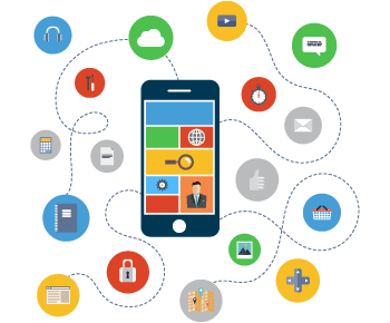 2. A Focus on Mobile
Google has announced that they are moving towards mobile-first indexing. What’s that mean? It’s a mobile world these days, and desktop just lives in it.
Your mobile site needs to be more optimized and user-friendly than ever. Consider these stats:
- Nearly 60% of web traffic now comes from a mobile device
- 57% of mobile users won’t recommend you if you have a bad mobile site
- 40% of users go to the competitor’s site after a bad mobile experience.
These trends mean that mobile and responsive design in your WordPress website development are both top priorities.
3. Microcopy
The devil is in the details. Tiny details like a little sentence here or there can actually make a massive difference on your site.
These little blocks of forgotten text may appear on your:
- Buttons
- Forms
- Pop-ups
- Thank you screens
- 404 pages
Don’t think two or three words can make a difference? Look up the marketing guru who changed a few words, changed a button up a little bit, and opened up 300 million dollars in sales, and see if your mind is changed. As we said, the devil is in the details and he’s ready to deal!
 4. User Experience
 4. User Experience
Forrester Research has reported that a 10% jump in a UX (User eXperience) score at the highest level can translate into more than $1 billion.
More companies are investing in User Experience because it is the art and science of figuring out where your website may be losing users and leaking sales leads.
You can do your best when you’re laying everything out and planning how you anticipate your users will use your site in the early stages of WordPress website development. But that’s not enough.
Crafting a good user experience is an iterative ongoing process, with lots of testing and tweaking.
5. Attention Ratio
Don’t give your users too many possible destinations, or they will go nowhere. Nobody likes sensory overload!
Keep things simple. Each page needs a purpose. Focus on one purpose and only that goal. Otherwise, you’re watering down your message, losing traction, and losing sales.
Your attention ratio needs to be 1:1. One goal for one call-to-action.
Let’s assume your goal is for users to get an online quote. So your “Get a Quote” button needs to get 100% of the attention of your users.
If you run with a nice lean page and only “Get a Quote” as your single call-to-action, it gets 100% of the attention. But if you add a “Join Our Mailing List” button, the Quote button is now only getting 50% of the attention it needs.
And if you add a third button, you’re already down to 33%. See how that works? Remember: K.I.S.S. Keep it super simple.
6. Intent-Based Marketing
You may pride yourself on the detailed demographic data you have on your clients. You know them and exactly what they want. Right? Well… Not totally.
You need to understand why your users are coming to your site; not just who. Google recently said that relying on demographic data alone could cost you more than 70% of potential mobile shoppers!
So don’t assume that you know. You need to know that you know.
7. Shorter Forms
WordPress website development experts are seeing the benefits of keeping your lead forms nice and short.
A lot of people would rather not fill out a lead form. They would rather visit the contact page and find an email address. But almost nobody wants to fill out a long form like they’re at the DMV.
In fact, you could increase your conversions by as high as 120% by reducing the number of fields on your form.
8. Drag and Drop
Simple can be beautiful.
Drag and drop widgets are gaining traction, becoming more popular and more used, via a number of WordPress plug-ins.
Beaver Builder is gaining significant traction, offering website builders the capacity to drag and drop onto any page configurable blocks or regions of content, making managing your website experience much simpler. You can position images and text with precision, and build column-based layouts in minutes.
9. Shopify Integration
 9. Shopify Integration
Shopify’s growth has been absolutely staggering and they’re still growing. They saw a subscription revenue jump of 67% in Q4 of 2017 alone.
Shopify and WordPress are kind of like the two most popular kids in school, but they actually get along well. Shopify offers numerous WordPress templates and plugins for a seamless sync.
Simplicity and scalability will mean you’re going to see even more people setting up their online store via WordPress and Shopify.
10. Micro-Moments
There is a fraction of a second when your user is looking at your site and thinking about pushing your “Contact” or “Buy” button. That’s called a micro-moment, and they can either make or break your conversions.
Will something stand in their way? Maybe your form is too long, or the user is worried that they may have to use their credit card. Mastering micro-moments means anticipating anything that can get between your user and your button.
One way to accomplish this can be using a bit of the microcopy we talked about earlier. Adding either of these two sentences above your lead form can help stop objections before they even enter a user’s mind:
- You do not need to use your credit card
- You’re free to cancel anytime
Or maybe you could add a bit of social proof to let them know they’re about to make a great decision, like “Join our 10,000+ happy users.
Hire a Monkey To Do Your WordPress Website Development
For almost a decade now our monkeys have helped our clients solve more than 100 website, design, marketing, and search engine optimization challenges.
How can we help you? Click here to get a quote.