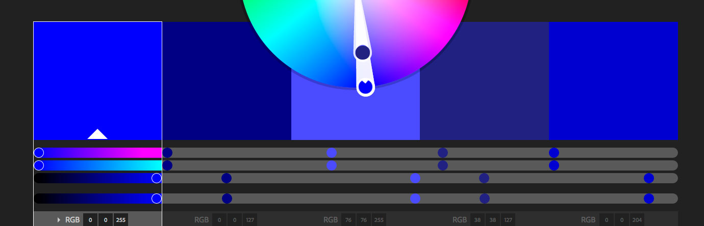
A basic study of the world’s most accepted color.
The color blue, one of the 3 additive primary colors (Red, Green, Blue – or known as RGB) and one of the 3 subtractive primaries (Red, Yellow, Blue – or also known as RYB in the painting world) is the world’s most well-accepted color. This really isn’t surprising, remember the last time you asked someone what their favorite color was? If it wasn’t blue – it was probably in their top 3. In contrast to this colors like yellow are typically love it or hate it.
Why is blue so popular?
Sally Augustin, Ph.D., an environmental psychologist who is an internationally recognized expert on human-centered design, believes that we are most receptive to the color blue because it goes way back to the primitive where blue skies and watering holes were seen as good signs. Blue is a nice safe color.
If audience research, environment, or circumstances don’t give you any definitive color choices to go with, you can probably use blue, it’s a good fallback and will usually be met with the least resistance.
The many faces of blue – some color psychology
Whether you are preparing to design a logo, or product package, or even painting your home or office, taking color psychology into account is often handy (and necessary). Generally speaking, the color blue is associated with trust, harmony, calm, faithfulness, and safety. In more relational terms it is often associated with the sky, water, and ocean, and is cool or cold in temperature.
There are even studies that show that the color blue is an appetite suppressant (so buy some blue plates if you need to drop a few pounds). Blue is probably not so ‘appetizing’ because the “color blue” doesn’t really exist in any of the foods we regularly eat.
To be even more granular, different shades of blue can have different meanings. For example, light blue can be associated with open spaces, calm, and innocence. Darker blues, like those closer to a navy, are associated with tradition, dependability, and solidity (this is probably the reason it’s so popular with banks, trust companies, and investment companies). Other blues that fall in the middle can promote or project trust, productivity, professionalism, sincerity, and even sadness. Blue can also affect temperature; a blue room can make a room feel physically cooler.
Complimenting blue
A complimentary color is one that sits directly opposite another hue on the color wheel. In this case, orange will go well with blue. There are other color schemes like triadic, monochromatic, compound, and analogous. The color scheming tool, Kuler (https://kuler.adobe.com/create/color-wheel/) is great for creating these schemes, so go ahead and play with it and see how many harmonies you can create with blue as the primary hue.
At Cheeky Monkey Media we love the color blue, even though it’s not in our brand color scheme; it is in Drupal’s [https://drupal.org/], our favorite Content Management System (CMS).