Prerequisites:
- RequireJS (and some knowledge of how to use it)
- IntentionJS
- A brain
- Bananas
There are plenty of reasons you shouldn’t HAVE to use IntentionJS, but it’s just so good when you NEED your fix, of DOM manipulation.
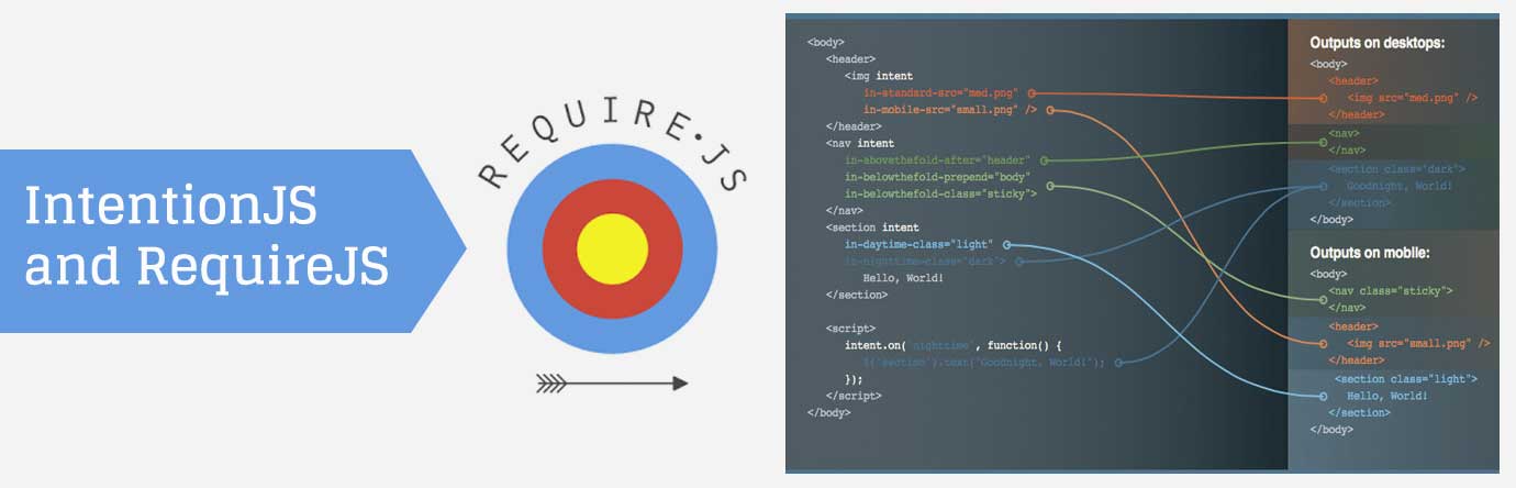
Normally a responsive website should be designed so that when you expand or collapse the viewport (effective screen), the DOM elements flow naturally from left to right, and top to bottom. The order is preserved, and it was designed so that those elements follow that flow in terms of importance and usability.
Admittedly, this does limit us at times, and we need elements to be in completely different placements in the DOM, depending on the device used. Sure we can mess with duplicated content by hiding and showing the right elements based on the screen size [please don’t, it’s bad], or doing some fancy schmancy CSS floating and absolute positioning, but then you start to get other fun issues, that go beyond the scope of this banana log.
So, we’re left with manually moving the elements around. You could start using the append() and after() functions say, from jQuery, but that also gets complicated.. setting screen widths, window resizing, or using Modernizr.mq (media query), etc. All messy in some form or another.
We like clean, even though we like poo, we still like clean.
Our Hero, IntentionJS
From the mouths of the intentionJS magicians: (http://intentionjs.com/)
“Intention.js offers a lightweight and clear way to dynamically restructure HTML in a responsive manner.”
Good right? riiight.
Okay, so we all have our own methods for including JS and writing libraries and code. Here’s what we monkeys do.
Starting with RequireJS
We like using requireJS. A lot. In fact, I get a banana every time I do. So in the main.js file loaded by requiring we have:
requirejs.config({
paths: {
// vendor
'intention': 'vendor/intention',
'underscore': 'vendor/underscore-min',
'viewportsize': 'vendor/viewportSize-min',
// custom
'jquery': 'modules/jquery-global',
'intentcontext': 'modules/intentcontext',
'homepage': 'modules/homepage',
'initintent': 'modules/initintent'
},
});
Here we are just telling require where to find all our ‘required’ files when we ‘require’ them. Yeah.. there is probably a better way of saying that. *puts on the deal with it glasses*
Intention requires underscore, so we’re including that. Also, we’re using a little library called ‘viewportsize’. Why? well because different browsers report different viewport sizes, based on whether or not it’s showing the scroll bar. That’s a problem, this fixes that problem. (https://github.com/tysonmatanich/viewportSize)
Then we include jQuery, cause we need it. Then comes some magical code with unicorns.. and monkeys.
require([
'jquery',
'underscore',
'intentcontext',
], function ($, _, IntentContext) {
'use strict';
// DOM ready
$(function() {
// js loaded only on homepage
if ($('body').hasClass('front')) {
require(['homepage']);
}
if ($('html').length > 0) {
require(['initintent']);
}
}); // DOM ready
});
So here, we’re just including the needed libraries for the site in general, and then checking if we’re on the homepage, if so, include the homepage module. Then the very last that we include in the initialization of the intent. Think of it, as intentions’ big red “go” button. We’ll get to these a bit later. For now, just know, that we are making sure that the intent file is included last since we’re doing all ‘intention’ setups first. Since requiring loads these in ORDER, of the code inclusion, we’re able to do all the setup first, then lastly initialize it.
IntentContext.js
This is where we set up our ‘contexts’. A context is basically a ‘switch point’ – a point a which stuff is supposed to happen. Each ‘context’ is associated with a screen size (these values should match your CSS media queries for major layout changes)…
IntentContext.bp_desktop = 1025;
IntentContext.bp_tabletlandscape = 769;
IntentContext.bp_tablet = 641;
IntentContext.bp_mobilelandscape = 321;
IntentContext.bp_mobile = 0;
These are the breakpoints where major layout changes happen (for the purpose of this blog). Yours would match that of your CSS breakpoint values.
Next up, make our contexts. As you will see, each context has a name, and I’m setting the “min” value to the breakpoint value that I set in the above code. So basically, the ‘desktop’ context will get triggered every time the browser hits the “1025 pixel” viewport width or above. (It won’t keep re-triggering events though, as you increase viewport width above that, which is nice.) All the other ‘contexts’ will get triggered at their respective screen width values.
IntentContext.horizontal_axis = IntentContext.intent.responsive({
ID: 'width',
contexts: [{
name: 'desktop',
min: IntentContext.bp_desktop
}, {
name: 'tabletlandscape',
min: IntentContext.bp_tabletlandscape
}, {
name: 'tablet',
min: IntentContext.bp_tablet
}, {
name: 'mobilelandscape',
min: IntentContext.bp_mobilelandscape
}, {
name: 'mobile',
min: IntentContext.bp_mobile
}],
matcher: function (measure, context) {
return measure >= context.min;
},
measure: function () {
IntentContext.v_width = viewportSize.getWidth();
return IntentContext.v_width;
}
});
So, there is a thing. It’s the thing you may need. Normally intention won’t activate the context on the first-page load, which you may need. We will get to that. (This is what that initintent.js file is for).
Homepage.js
Now we need to tell which elements were to be placed in the dom, according to whatever ‘context’ is triggered. You can either go directly into the HTML and add all the special intention attributes to the elements, or do it via JS. I like doing it in the JS, I find it cleaner.
So in our Homepage.prototype.intent = function () function:
var footer = $('.l-footer');
footer.attr('intent', '');
footer.attr('in-desktop-after', '.l-header');
footer.attr('in-tabletlandscape-after', '.l-main');
footer.attr('in-tablet-after', '.l-main');
footer.attr('in-mobilelandscape-after', '.l-header');
footer.attr('in-mobile-after', '.l-header');
IntentContext.intent.on('desktop', function() {
footer.attr('style', 'border: 4px solid red;');
});
IntentContext.intent.on('tabletlandscape', function() {
});
IntentContext.intent.on('tablet', function() {
});
IntentContext.intent.on('mobilelandscape', function() {
footer.attr('style', 'border: 4px solid white;');
});
IntentContext.intent.on('mobile', function() {
footer.attr('style', 'border: 4px solid blue;');
});
In the first line, we just get the element we want to target. The next lines are key.
I’m now manually adding all the required contexts on that element, so for each ‘breakpoint’ context, we know where to place the footer. The syntax is as follows
footer.attr(‘in-[your-breakpoint-name]-[move-function], ‘[dom element]’)’
‘your-breakpoint-name’ is just the name you associated with the breakpoint, up in the IntentContext.js file.
‘move-function’ is the method in which you want to place that element. They work just like jQuery’s manipulation functions [append(), before(), after(), prepend()]
‘dom-element’ is just the element you are specifying to be “moved to”.
So in this case, when the browser hits the ‘desktop’ layout screen width, we are putting the ‘.l-footer’ element just after the ‘.l-header’ element in the DOM. The next lines all work the same and specify where the element needs to go, for whichever context (screen size).
Then, we have some more magical code.
IntentContext.intent.on('desktop', function() {
footer.attr('style', 'border: 4px solid red;');
});
IntentContext.intent.on('tabletlandscape', function() {
footer.attr('style', '');
});
So, for each context, we can run some custom code of any kind. In this case, every time we hit the ‘desktop’ context, we are going to add a border to the footer element. Every time we hit the ‘tabletlandscape’ context, we make sure to remove any lingering styles. Etc…
I normally like to use these methods to ‘reset’ certain things that may have been triggered on an alternate layout.
Lastly, the Initialization of Intent. This will allow us to use those .on() [in above code] functions on page load as well.
Know that all this will only happen on the homepage though. If you need this to happen on all pages, you can create a separate module that can handle site-wide context changes, and just include it in the main.js require section.
InitIntent.js
IntentContext.horizontal_axis.respond();
IntentContext.intent.elements(document);
$(window).on('resize', IntentContext.horizontal_axis.respond);
So these 3 lines just get everything going. Check out the intention.js website for further detail, but suffice to know, they get intention up and running.
That should be it to have it all working nicely and being able to do some sexy DOM manipulation without too much pain.